| prefixCls |
string |
rc-input-number |
Specifies the class prefix |
| min |
Number |
|
Specifies the minimum value |
| onClick |
|
|
|
| placeholder |
string |
|
|
| max |
Number |
|
Specifies the maximum value |
| step |
Number or String |
1 |
Specifies the legal number intervals |
| precision |
Number |
|
Specifies the precision length of value |
| disabled |
Boolean |
false |
Specifies that an InputNumber should be disabled |
| focusOnUpDown |
Boolean |
true |
whether focus input when click up or down button |
| required |
Boolean |
false |
Specifies that an InputNumber is required |
| autoFocus |
Boolean |
false |
Specifies that an InputNumber should automatically get focus when the page loads |
| readOnly |
Boolean |
false |
Specifies that an InputNumber is read only |
| name |
String |
|
Specifies the name of an InputNumber |
| id |
String |
|
Specifies the id of an InputNumber |
| value |
Number |
|
Specifies the value of an InputNumber |
| defaultValue |
Number |
|
Specifies the defaultValue of an InputNumber |
| onChange |
Function |
|
Called when value of an InputNumber changed |
| onPressEnter |
Function |
|
The callback function that is triggered when Enter key is pressed. |
| onFocus |
Function |
|
Called when an element gets focus |
| style |
Object |
|
root style. such as {width:100} |
| upHandler |
React.Node |
|
custom the up step element |
| downHandler |
React.Node |
|
custom the down step element |
| formatter |
(value: number|string): displayValue: string |
|
Specifies the format of the value presented |
| parser |
(displayValue: string) => value: number |
`input => input.replace(/[^\w\.-]*/g, '')` |
Specifies the value extracted from formatter |
| pattern |
string |
|
Specifies a regex pattern to be added to the input number element - useful for forcing iOS to open the number pad instead of the normal keyboard (supply a regex of "\d*" to do this) or form validation |
| decimalSeparator |
string |
|
Specifies the decimal separator |
| inputMode |
string |
|
Specifies the inputmode of input |
 ## Install
[](https://npmjs.org/package/rc-input-number)
## Usage
```js
import InputNumber from 'rc-input-number';
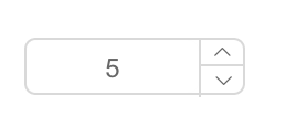
export default () =>
## Install
[](https://npmjs.org/package/rc-input-number)
## Usage
```js
import InputNumber from 'rc-input-number';
export default () =>